According to scientists and certain optimistic enthusiasts, we might be ready to send the first…
Beta 3 Clinicards: a completely new design
Every self-respecting management book for startups will tell you that “no product survives its first contact with the users“. Experiencing this hard lesson firsthand, is something of a blessing as well as a curse. A curse because it utterly shatters your planning, a blessing because it’s always better to uncover an issue sooner than later.
So what happened? Our approach for the graphical and interactive aspects of the Clinicards was based on the Wallet-app found in all iPhones; brilliant we first thought! It seemed really intuitive to us to select a card, input data, ‘flip‘ the card to the back to display the results, and then back on the pile….But our users (physicians, nurses and patients) completely disagreed! After two days of user-testing in the Slingeland Hospital we found out the hard way that all the back and forth ‘flipping‘ was just too confusing. In addition, the nurses had a view of their own in regards to how the website should display the patients. So, back to the drawing board we went…
It took some figuring out, but now we’re real happy to announce that our new proposal has been well received by the user group. A full redesign that was developed from scratch and whereby the content, i.e. the patients‘ results, were the primary focus. Lots of white areas with a well-balanced color scheme to emphasize the more important items. Moreover, we also took the first steps towards standardizing the underlying code in iOS; this enables us to work towards an efficient development process with a robust code.
This newsletter sets out the key changes for Clinicards Beta 3. And as always, we remain very receptive to hearing about any comments or ideas you may have.
NEW: QuickViews
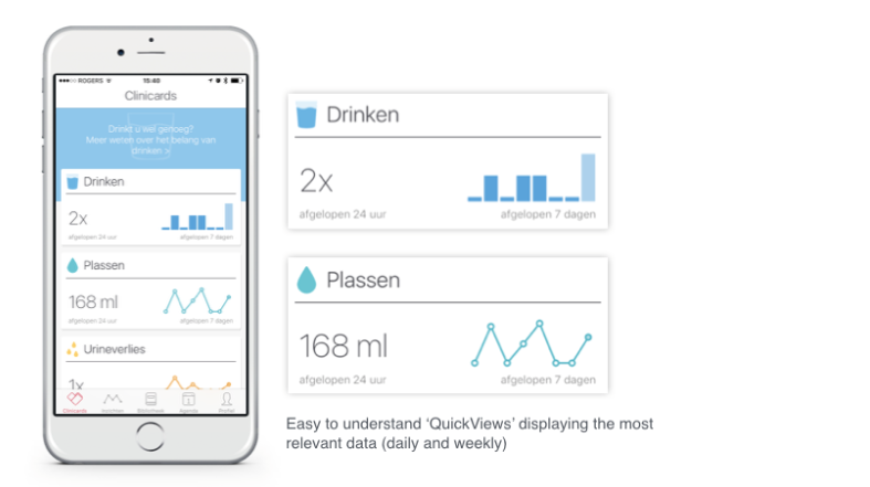
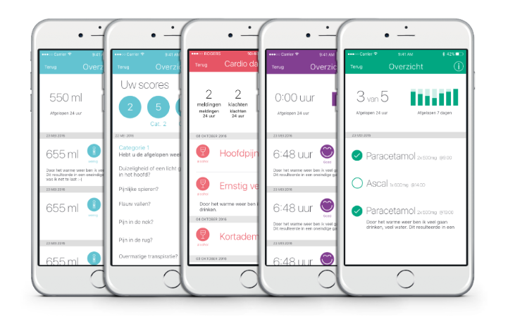
The overview is the app’s most important screen. Here the patient can easily check the statusses of the selected Clinicards. The new design displays this information in an even more comprehensible manner. ‘QuickViews’ features the key indicator in a day-result as well as a small graph of the week-result. Tapping on a QuickView takes you to the input screen of the corresponding Clinicard.
Input Screen
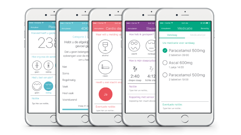
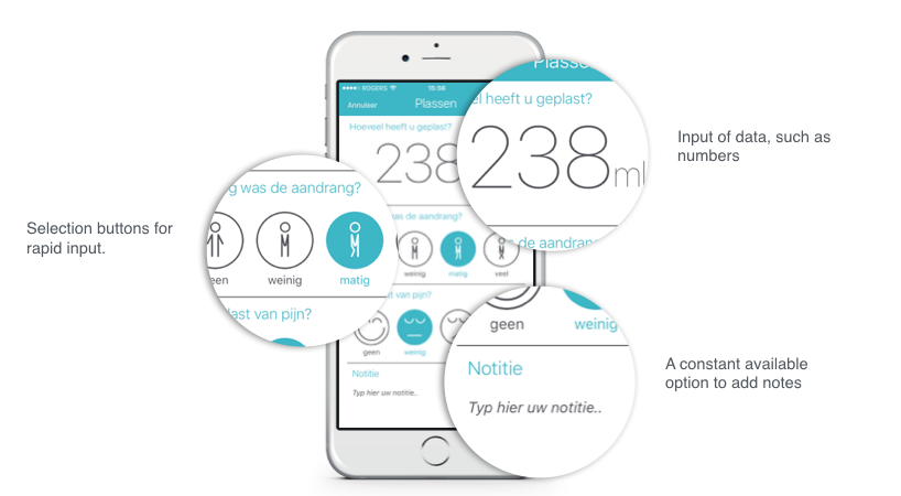
We put a lot of thought into the optimization of the input screen. Simplicity was key. Due to our standardized approach, all Clinicards have been built in the same way. This enhances recognizability for the patients and simplifies our development process.
In the previous beta version the cards flipped over after data had been input, in this new Clinicards version the screens slide in and out of position, which is even more intuitive.
Overview Screen
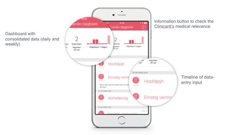
The overview screen has also been radically overhauled. Two sections successively show the daily and weekly results, and there is a chronological display of all the entered data on a timeline. Patterns are thereby clearly noticeable. This screen also enables the pulling up of medically relevant information about the Clinicard itself.
Goodbye hamburger menu, hello tab bar
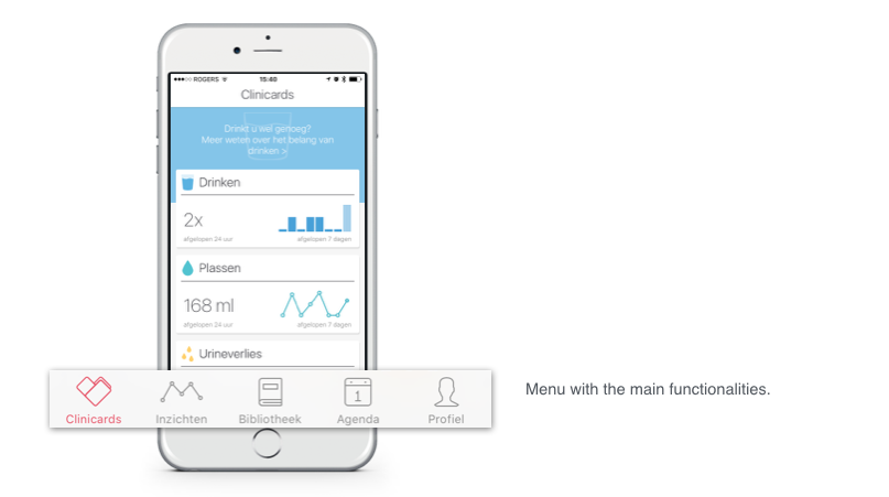
Volumes have been written on the difference in user-friendliness between the hamburger menu and the tab bar. We first opted for a hamburgermenu to call up the different functionalities, but this wasn’t always grasped by the users.
Based on further insights, we introduced the Beta 3 tab bar instead, thereby making all the key functionalities stand out and accesible at first sight.
New design implemented across the board
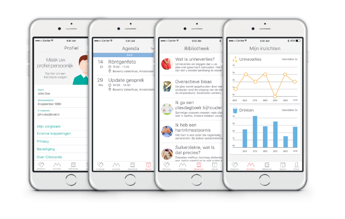
All other screens such as Insights, Library, Agenda and Profile have, of course, also been amended according to the new design.
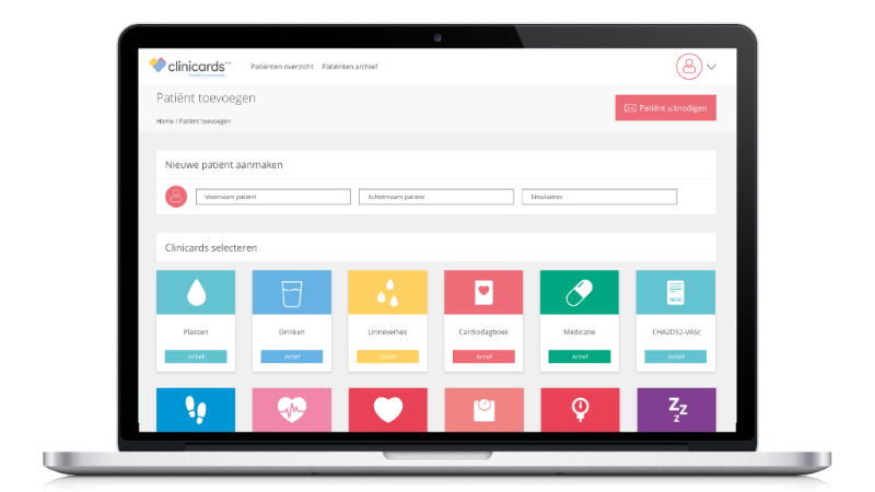
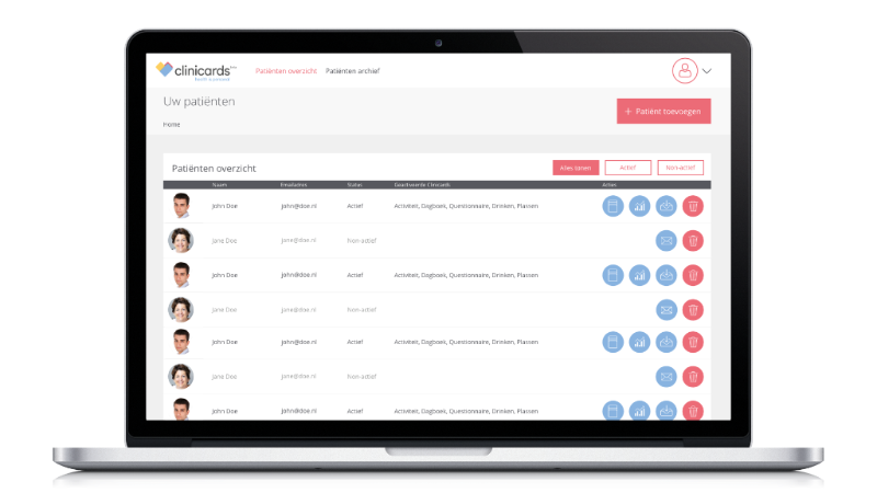
New website
Our website has also been given a makeover in order to be in line with the new overal look and feel. We are currently working hard to add more functionalities to the website and plan to provide more information about that in Beta 4.
Under development: Designed for Privacy
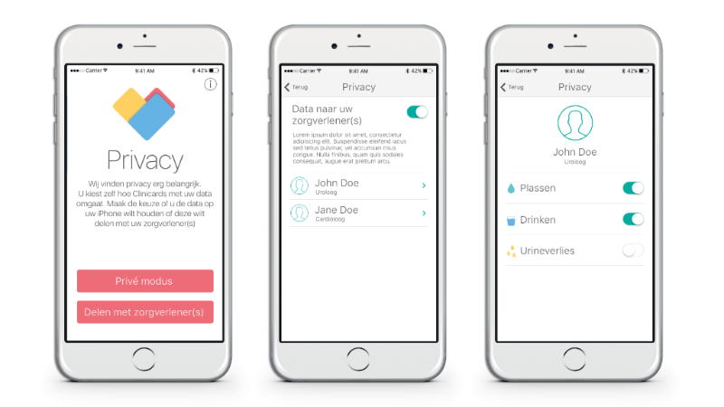
We don’t believe the widespread mantra that ‘privacy is dead‘. Privacy is paramount in a medical context and digital innovations can not permit themselves to ignore it. We are of the opinion that the patients themselves must be in control; they should be able to differentiate between data they prefer to keep to themselves and other data that should be shared with healthcare professionals or carers. The option to decide at a granular level which data goes where is what we call ‘Designed for Privacy’, something our team is actively looking into. It will only be made available in the next Clinicards Beta version but we thought we’d give you a little glimpse of what’s in store…
